How to
Access summaries
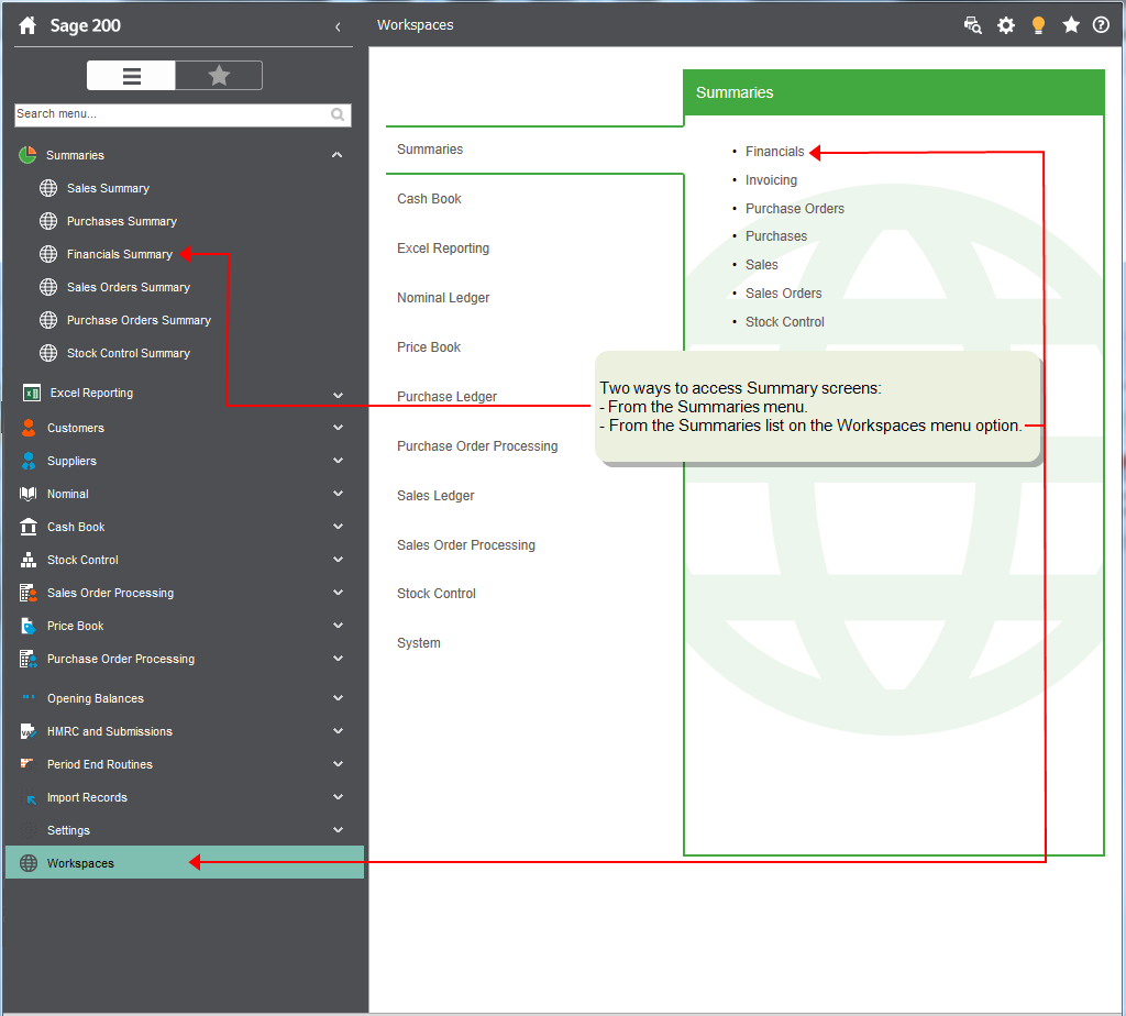
You can access summaries from two locations:
- There is a dedicated Summaries section on the menu.
- Summaries are listed in a section on the Workspaces section of the menu.
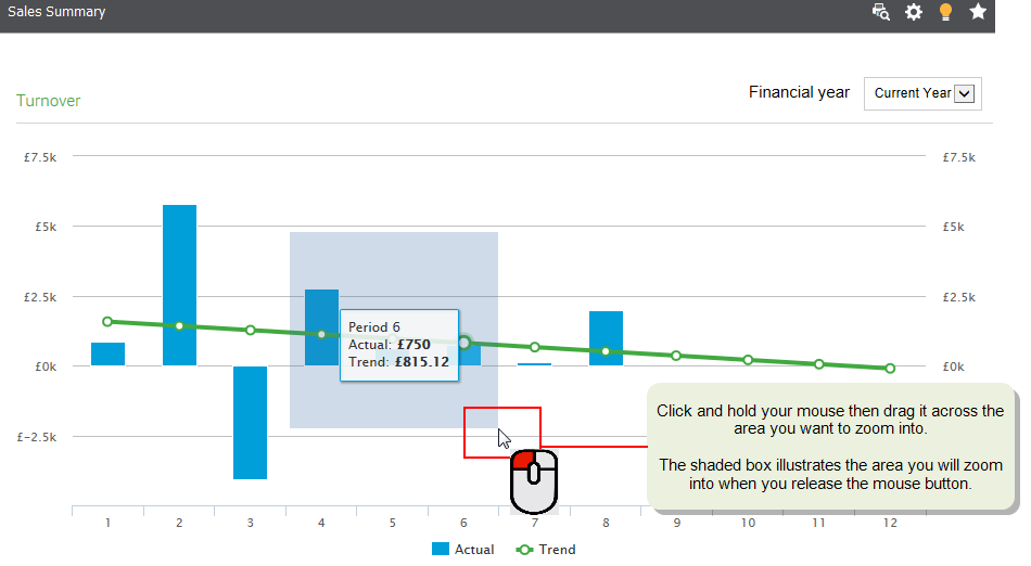
Use bar and line charts
You can click and drag to zoom in:
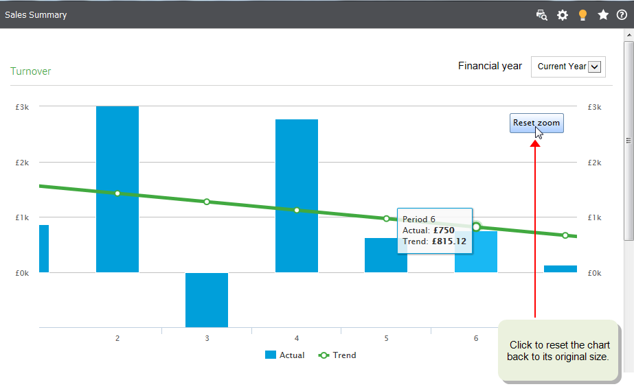
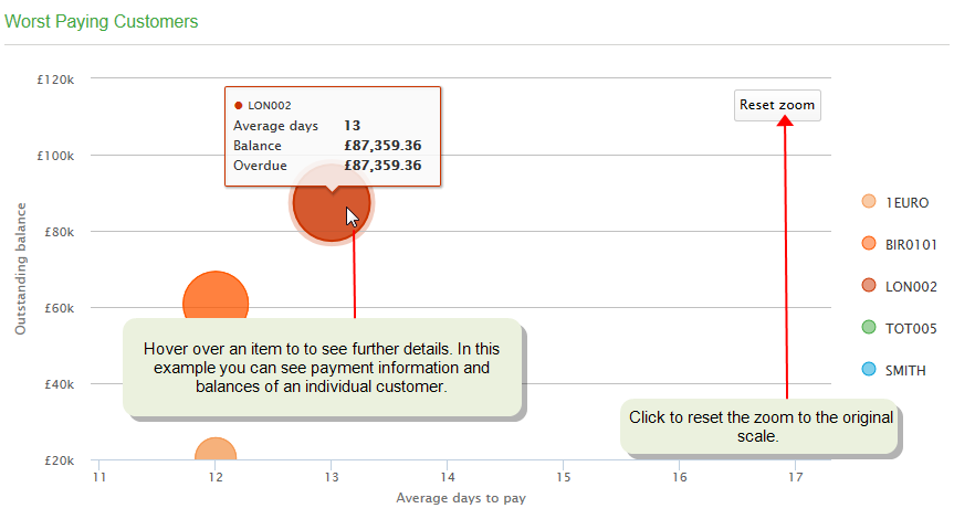
Select Reset Zoom to return to the original scale.
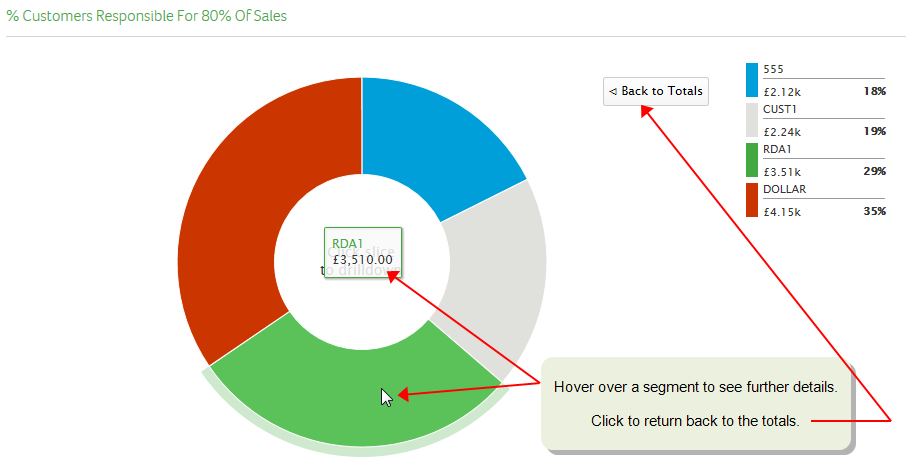
Use pie and doughnut charts
Click on pie and doughnut charts to drill-down into the detail.
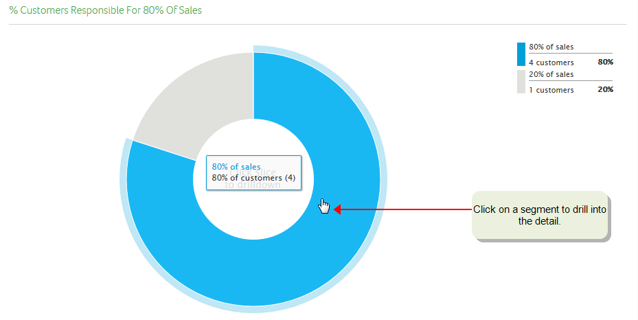
After viewing the detail, you can return to the original summary information.
Use bubble chart
You can click and drag to zoom in:
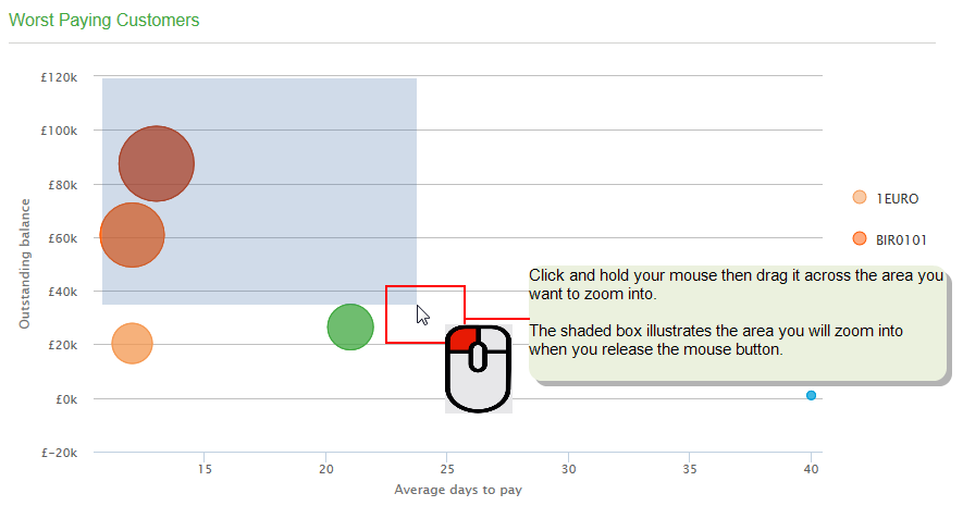
You can hover over an item to see more information.
Useful Info
About summaries
Summaries provide an overview of areas of your business, to help you quickly assess your business performance. You can select summaries from the Summaries option in the menu, or from within the Workspaces menu option.
Within the Sales Summary you can drill down to see the transactions that make up the total values shown in the chart. Additionally, calculations for each summary chart are based on the following variables.
| Chart | Based on |
|---|---|
|
Sales Summary > Turnover |
Current financial year |
| Sales Summary > Outstanding Debt | Today's date |
|
Sales Summary > Top Customers |
Current financial year |
|
Sales Summary > Worst Paying Customers |
Today's date |
|
Sales Summary > Customer % Responsible for 80% Of Sales |
Current financial year |
| Purchases Summary > Turnover | Current financial year |
|
Purchases Summary > Supplier Invoices Overdue |
Today's date |
|
Purchases Summary > Top Suppliers |
Current financial year |
|
Purchases Summary > Supplier Discounts Available |
Today's date |
|
Purchases Summary > Suppliers Owed the Most |
Today's date |
| Financials > Profit By Period |
Current financial year |
|
Financials > VAT - YearTo Date |
Nominal accounts credit year to date and debit year to date |
|
Financials > Creditor/Debtor Totals Last 12 Periods |
Last 12 periods based on today's date |
|
Financials > Budget vs Actual |
Current financial year |
|
Financials > Budget Variance |
Current financial year |
| Financials > Cash On Hand Last 12 Periods | Last 12 periods based on today's date |
|
Financials > Main Bank Account |
Bank statement closing balance |
| Sales Orders > Order and Return Values | Last 12 months based on today's date |
| Sales Orders > Overview | Last 12 months based on today's date |
|
Sales Orders > Despatches in the Last 12 Months |
Last 12 months based on today's date |
|
Sales Orders > 10 Top Selling Items In The Last 12 Months |
Last 12 months based on today's date |
|
Sales Orders > Sales Profit Value |
Last 12 months based on today's date |
| Purchase Orders > Order and Return Values |
Last 12 months based on today's date |
| Purchase Orders > Overview |
Last 12 months based on today's date |
|
Purchase Orders > Receipts in the Last 12 Months |
Last 12 months based on today's date |
| Purchase Orders > 10 Worst Suppliers for late deliveries |
Last 12 months based on today's date |
|
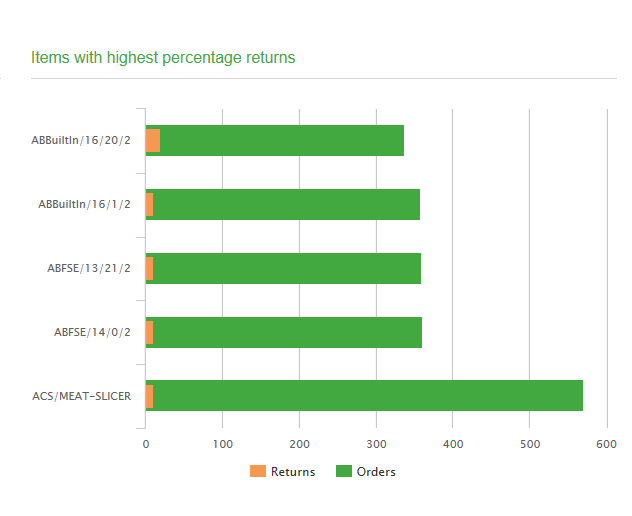
Purchase Orders > Items with highest percentage returns |
Last 12 months based on today's date |
| Stock Control > Stock In / Out - By Period |
Last 12 months based on today's date |
|
Stock Control > Value Of Stock |
Last period / current period based on today's date Note: This value is for all time initially and then from the time when you reset your trading values, using the Reset Trading Values option in Stock Control. |
|
Stock Control > Stocktakes By Warehouse In The Last 12 Months |
Last 12 months based on today's date |
|
Stock Control > 10 Items With Oldest Stock |
Based on movement balance and movement date (not reliant on financial or calendar year) |
|
Stock Control > 10 Items With The Highest Write Off Value In The Last 12 Months |
Last 12 months based on today's date |
Summary pages
Sales Summary
Note: You can drill down on the charts within the Sales Summary to view the transactions that make up the chart values. You can also perform actions on these transactions in the same way that you can when using the customer transaction enquiry workspace.
This shows the following views:
|
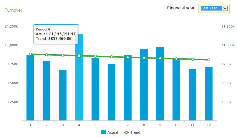
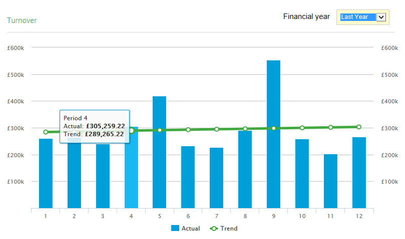
Turnover |
Shows the total sales value by period (invoices less credit notes) for the 12 periods up to the end of the current financial year. The trend line illustrates the trend of your sales through the year. Choose which financial year to display. Click a node on the trend line to see the actual and trend figures for the period. |
|
|
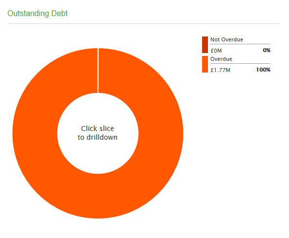
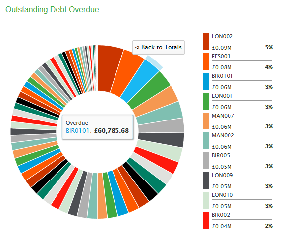
Outstanding Debt |
Shows your outstanding debt split into those that are overdue and those that are not. You can click onto a section to see the customers and the amounts they owe. |
|
|
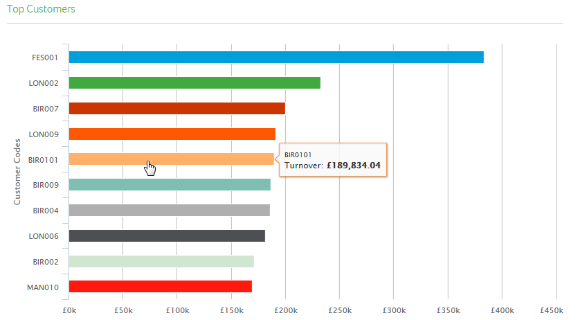
Top Customers |
Shows the value of sales in the current year of your top ten customers. Place you mouse over any customer to review the exact value of the sales they have bought from you. |
|
|
Worst Paying Customers |
Shows your worst paying customers. The size of the bubble represents the value of the outstanding debt and the distance from the left hand side represents the average time it takes the customer to pay their invoices. Hover over a bubble to see a breakdown of the exact amount outstanding and average days it takes them to pay. |

|
|
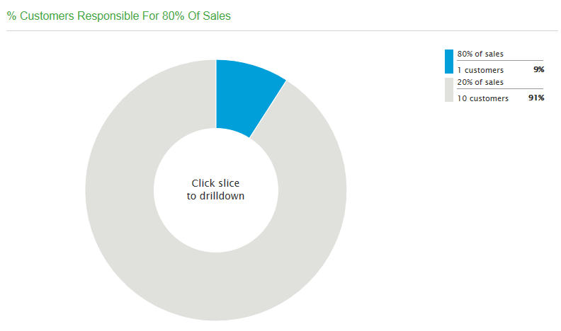
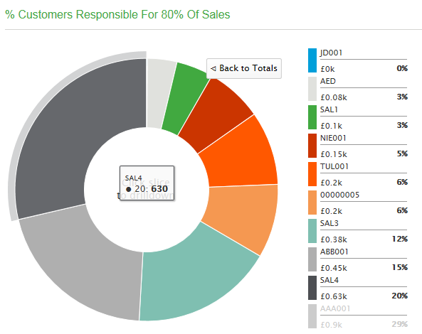
% Customers responsible for 80% of sales |
Calculates and groups the percentage of your customers responsible for 80% of your sales. The remaining customers are grouped together. Click on either of the groups to drill-down and see which customers fall into which group. Hover over any segment of the chart to see the name of the customer and value of sales to them |
|
Purchases Summary
|
Turnover |
Shows your purchases (invoices less credit notes) in each of the periods in a particular year. The trend line illustrates the trend of your sales through the year. Choose which financial year to display. Click a node on the trend line to see the actual and trend figures for the period. |
|
|
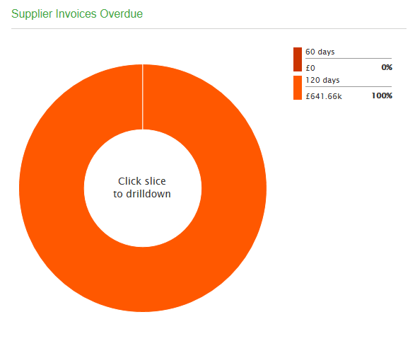
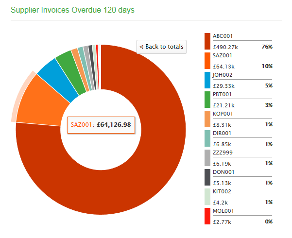
Supplier Invoices Overdue |
Shows your overdue invoices into groups based on the Due Date periods set in your Purchase Ledger settings. Click on a segment to see the supplier information. |
|
|
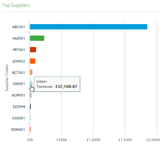
Top Suppliers |
Shows the value of purchases made in the current year from your top ten suppliers. Place you mouse over any supplier to review the exact value of the purchases you have made. |
|
|
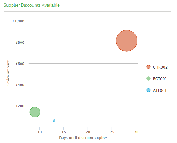
Supplier Discounts Available |
This shows invoices due for payment on or after today's date, where discount is still available. The size of the bubble represents the value of the discount available to you and the distance from the left hand side represents the time you have remaining to pay the invoice and claim the discount. Hover over a bubble to see a breakdown of the exact amount of discount you can claim and the number of days the discount is available. |
|
|
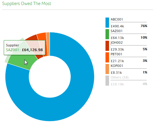
Suppliers Owed The Most |
This view shows which suppliers you owe the most, based on outstanding invoices per supplier. Hover over a segment to see the supplier name and the total amount you owe them. |
|
Financials Summary
This shows the following views:
|
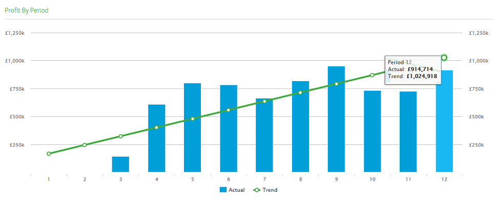
Profit By Period |
Shows the profit per period based for the 12 periods up to the end of the current financial year. It is calculated from your Income and Expenditure report categories. Click a node on the trend line to see the actual and trend figures for the period. Note: The chart may give different figures from the Profit & Loss Financial Statement, depending on how you have set up the Profit & Loss Financial Statement. |
|
|
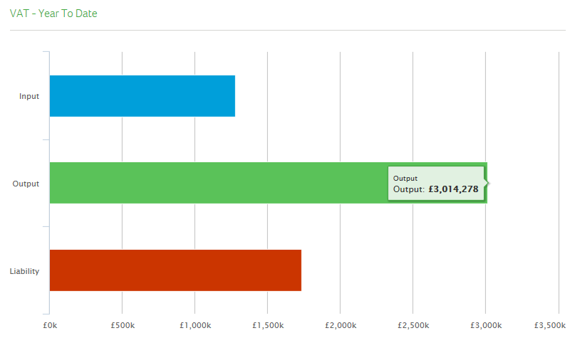
VAT - Year To Date |
Shows the Year to Date balance of your VAT Input and Output accounts. The difference between these is your VAT liability. Click a bar to see the exact figure. |
|
|
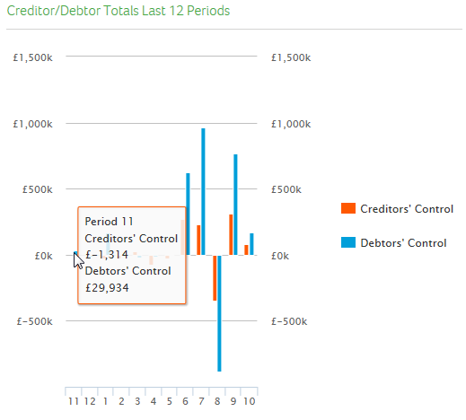
Creditor/Debtor Totals Last 12 Periods |
shows the total balance for all of your debtor and creditor accounts broken down into your accounting periods. Click a bar to see the actual balance for that period. |
|
|
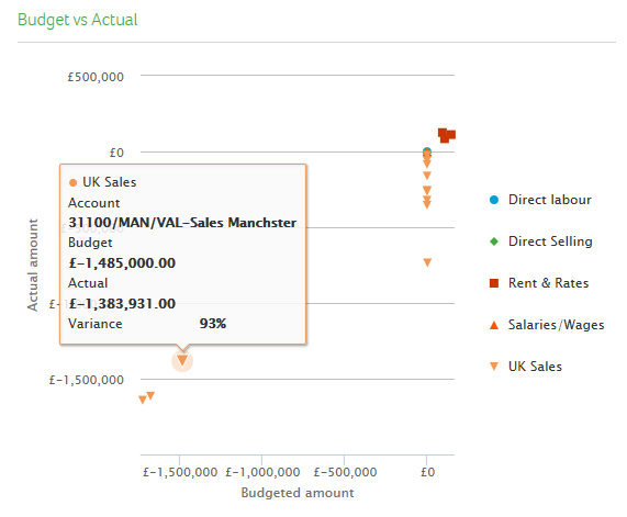
Budget vs Actual |
Shows the difference between the budget of a nominal account and its actual balance. Hover over an individual item to see:
|
|
|
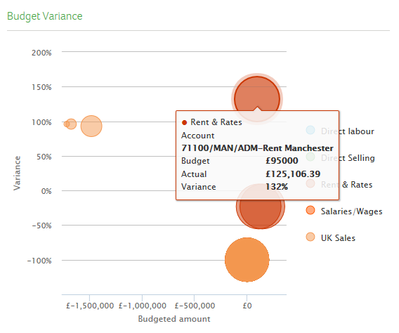
Budget Variance |
This view shows the budget variance. |
|
|
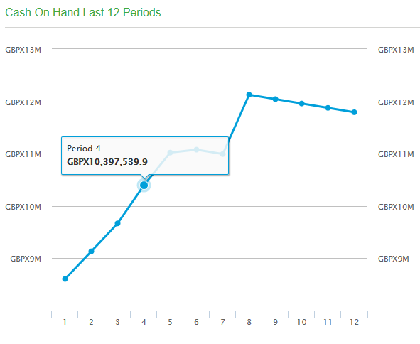
Cash on hand last 12 periods |
Shows the total balance on all nominal accounts associated with a bank account, per period for the current year. Hover over an individual node to see the exact amount of cash you held in at that point in time. |
|
|
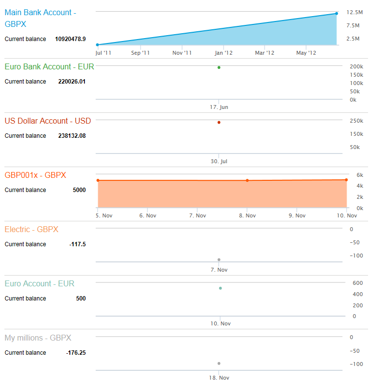
Bank Accounts |
Shows the balance of each bank account the last time they were reconciled. Click a node to see the statement date and closing balance. |
|
Stock Control Summary
This shows the following views:
|
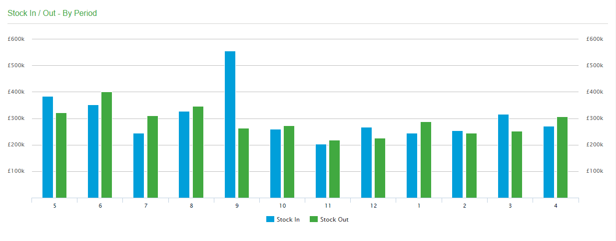
Stock In / Out - By Period |
Shows the value of stock in and out by period. Note: This includes internal transfers of stock between different locations. For example, discounting internal transfers, you might have £1000 in and £200 out. When you transfer £300 worth of stock items from location 1 to location 2, the graph will then show £1300 in and £500 out because the internal movements in and out are included. |
|
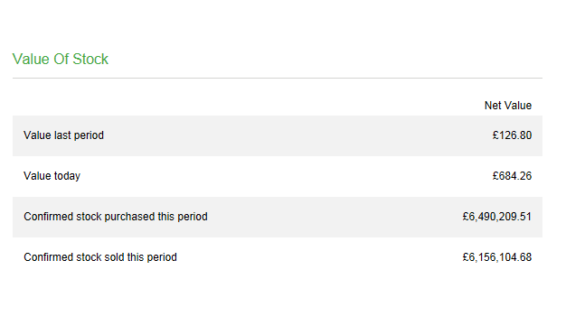
| Value Of Stock |
Shows an overview of your stock value. Note: This value is for all time initially and then from the time when you reset your trading values, using the Reset Trading Values option in Stock Control. |
|
|
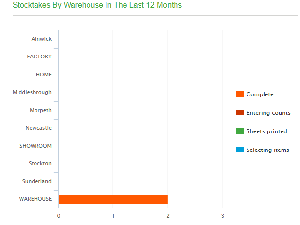
Stocktakes By Warehouse In The Last 12 Months |
Shows stocktakes by warehouse in the last 12 months. |
|
|
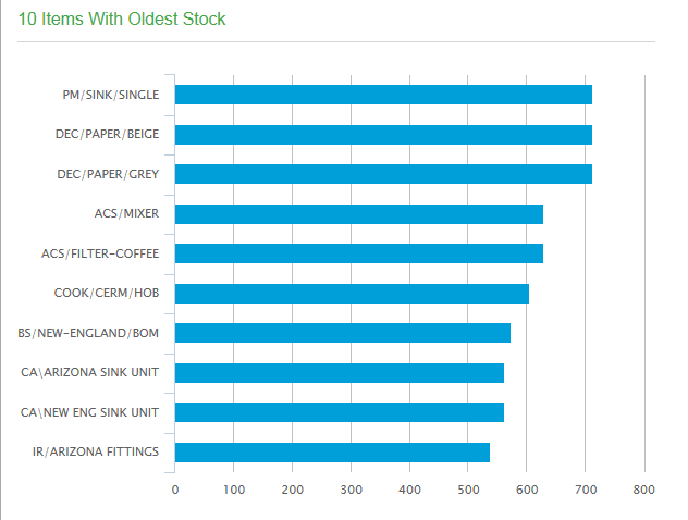
Items with Oldest Stock |
Shows your stock items with the oldest stock. |
|
|
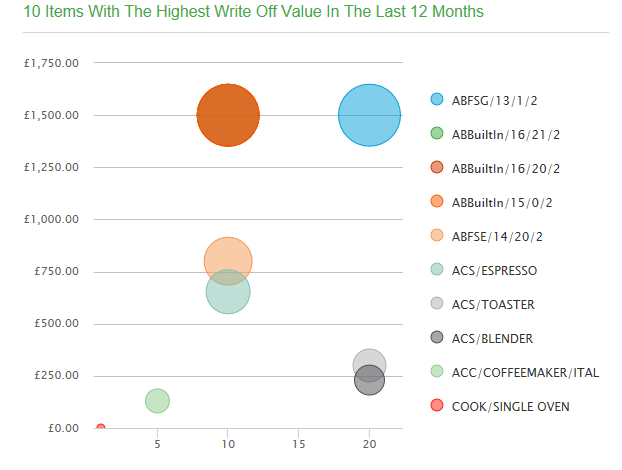
Value Of Stock Written Off In The Last 12 Months |
Shows the value of stock that has been written off in the last 12 months. |
|
Sales Order Summary
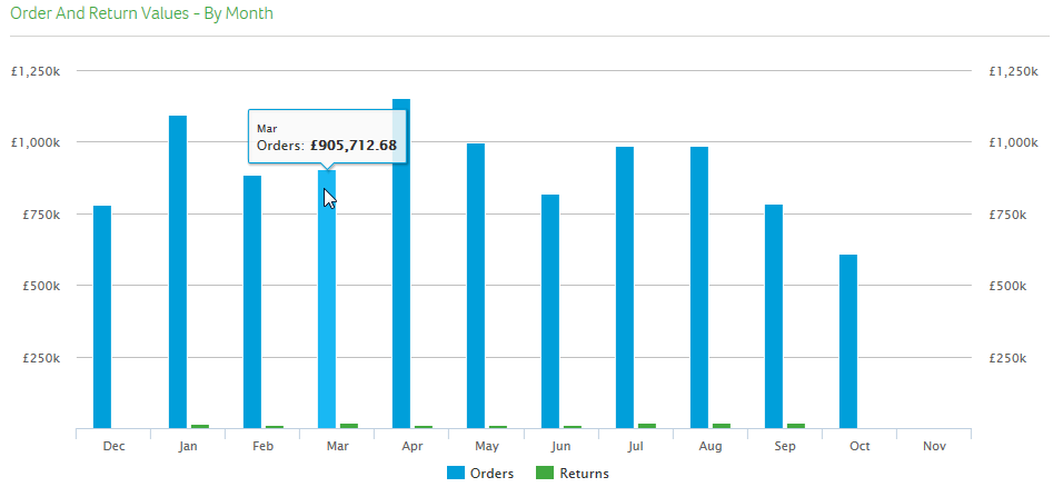
|
Orders and Return Values - By Month |
Shows the value of orders and returns by month. |
|
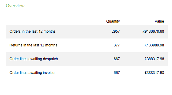
| Overview |
Shows a quick overview of your sales orders and returns. |
|
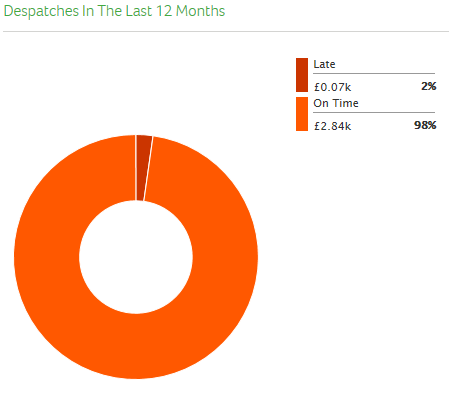
|
Despatches In The Last 12 Months |
Shows despatches within the last 12 months and identifies which were on time and which were late. |
|
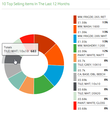
|
10 Top Selling Items In The Last 12 Months |
Shows your top 10 selling items within the last 12 months. |
|
|
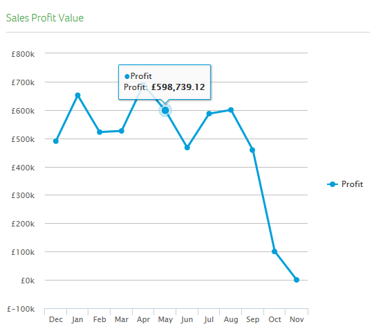
Sales Profit Value |
Shows the profit value per month, based on invoice profit. |
|
Purchase Order Summary
|
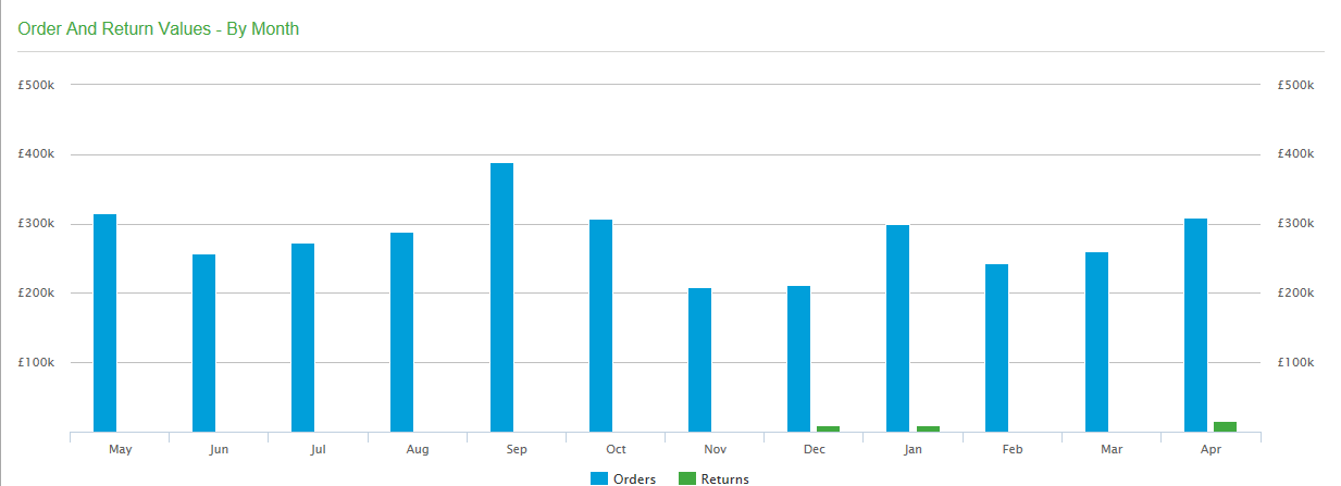
Orders and Return Values - By Month |
Shows the value of orders and returns by month. |
|
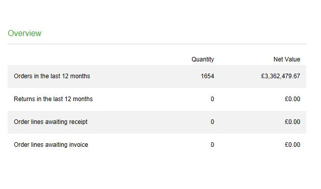
| Overview |
Shows a quick overview of your purchase orders and returns. |
|
|
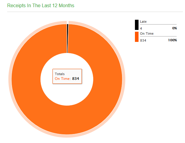
Receipts In The Last 12 Months |
Shows receipts within the last 12 months and identifies which were on time and which were late. |
|
|
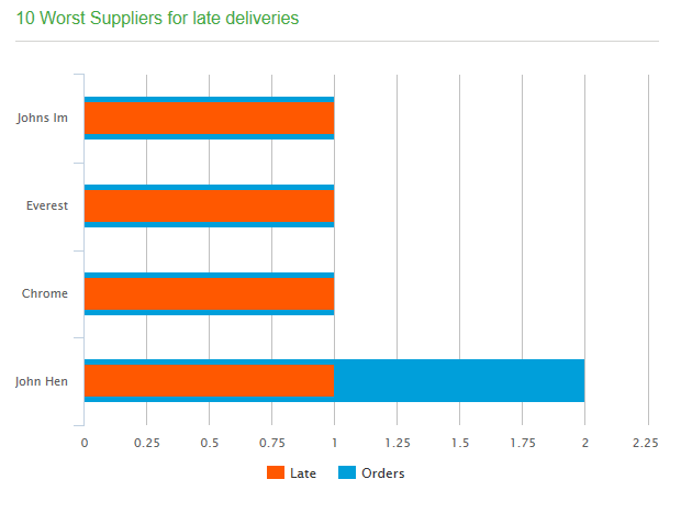
10 Worst Suppliers for late deliveries |
Shows your 10 worst suppliers within the last 12 months. |
|
|
Items with highest percentage returns |
Shows the most returned items by percentage. |
|